What are the key conventions that help you identify the print text (e.g. title, central image, review quotes etc.)
Central image:
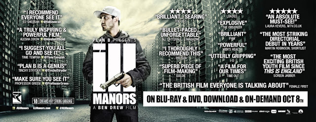
The central image presented is of Plan B with a gun presenting an action code, the main character has been used in the central image giving the audience an insight to the main character and the theme of the movie. The main character has his arm around the word 'ILL' making it effective as the image fits in with the text.
The background image is also interesting as it shows darker clouds being presented however they are being pushed into the sides as the white background is coming through maybe symbolises that this film has a positive ending and the negativity will be put to an end. On the sides of the image there are lots of tall buildings closely together which start of darker and become lighter towards the end. The building may emphasise the estates that the children grow up in, how they grow up in a dark background not having access to much and being deprived.
Flash/Cover/Sell lines:
The lines used in this text is sell lines written all over the cover. The sell lines include 'Plan B is a genius' and much more making the audience want to watch the movie, engaging them with the sell lines keeping them interested into watching the film.
Colour scheme:
The colour scheme of the DVD cover is black and white. The choice of the colour scheme gives a contrasting effect as both colours are totally opposite, where black represents negativity, and white represents positivity. Both colours used allow the text and the image to stand out as it is more clear and visible.
Title of publication:
The title of the publication is 'ILL MANORS' presented in big bold writing, 'MANORS' on the bottom on 'ILL' the text is closely presented together. 'ILL' is presented larger then 'MANORS' making it stand out. The text is presented in the colour white, contrasting it from the background as its black, making it stand out.
Language:
The language used is more promotional language as its used to promote the film making the audience realise that this film is a great hit, and its a 'must watch'
The language used is more promotional language as its used to promote the film making the audience realise that this film is a great hit, and its a 'must watch'
What design features help identify the Ill Manors brand
The way the background image is being presented as it shows contrasts with dark and light giving the audience a clue about the movie, making them dive into thinking about how the people in the film are being presented as coming from deprived backgrounds who lack the knowledge, attitudes and discipline due to how they've been grown up. For example, abandoning them leading them to be in a foster home, giving them a tough childhood as they would have to come across other children from similar backgrounds which give them an insight to a deprived childhood.
The gun held my the main character giving an action code, signifying to the audience that this movie will have lots of violence, this may also link to the colour scheme as they black may represent the violence that will be portrayed in the film as well.
What examples of synergy can you find with the broadcast platform or other print examples?
DVD:
the DVD cover could portray this image as its got lots of sell lines which could immediately engage the audience into purchasing the DVD
Billboard:
Billboards could be presented in certain parts of London, particularly west London as that's where more of the target audience would be located for this film.
Magazine:
Magazines such as a music magazine which could present the music video as well as the movie. Also they could present it in a film magazine which is targeted to teenagers.
Newspaper
The metro newspaper would be ideal for a print example as it would be located at the front page. Also the target audience for a metro paper is mainly young adults. Access to newspapers is also very easy as they could be found on the train while they are travelling, on the tube on the bus or even posted to their house.
No comments:
Post a Comment